Cyral Design Style Guide
A design system built to outlast the designer who built it.
The Cyral Design Style Guide was a component library and visual language built from scratch during my time as Lead Designer. It standardized typography, color, spacing, and component patterns across the product — giving engineers a single source of truth and eliminating the inconsistency that had accumulated from a team making individual styling decisions without guidelines.
Cyral's product had accumulated inconsistency quietly. Typography varied across screens, color values were technically different but visually similar, spacing was unstandardized, and border radii on buttons and inputs were mismatched with no apparent logic. Nobody had made these decisions badly — there simply hadn't been anyone to make them at all.
The engineering team was converting low-fidelity Google Slides wireframes into production UI, making individual styling choices without a shared reference. Each decision compounded the next. When a new engineer joined, there was nothing to hand them — they learned by asking colleagues which styles to use, slowing everyone down.
Rather than pausing feature development for a full cleanup, I built the system in parallel — defining critical styles and introducing them into new features as they shipped, while letting existing inconsistencies wait for natural refactoring opportunities. Initial executive buy-in was limited, so I found time around existing development cycles rather than asking for a dedicated workstream.
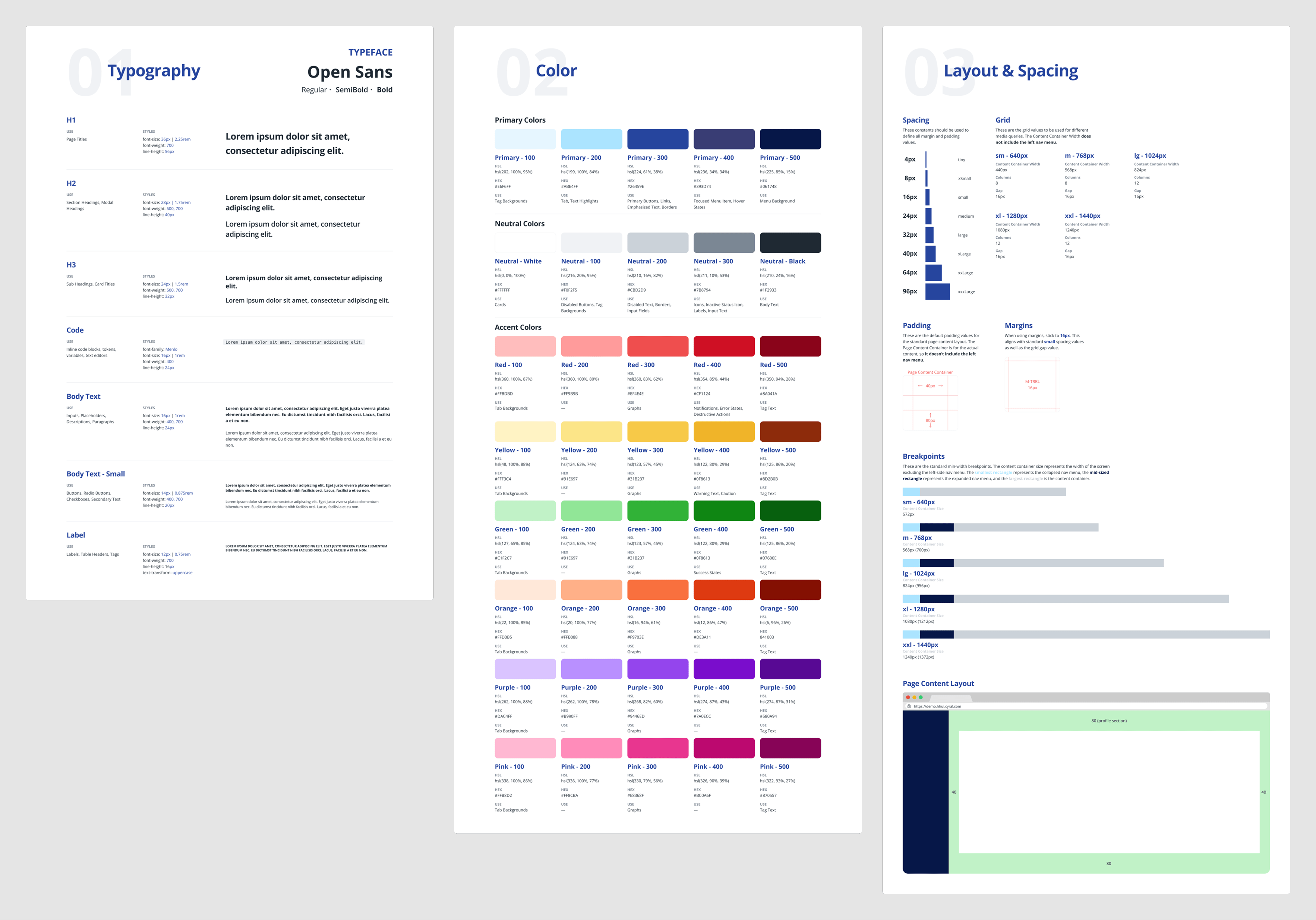
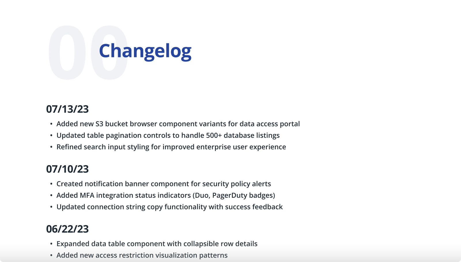
I established foundational styles and high-use components first — buttons, tables, iconography, cards — and structured the Figma file with individual pages per category plus a changelog that propagated updates automatically across projects. Working with engineering leads, I converted design decisions into developer-friendly formats: rem values, hex codes, pixel ranges. Documentation shifted from Google Slides screenshots to annotated Figma files with component references.
The Material UI decisions required judgment. Cyral's enterprise security focus needed a more authoritative aesthetic than MUI's defaults — we deepened the primary blue, softened button border radii for approachability while maintaining professionalism, and heavily customized data tables for complex database connection information. Form validation patterns stayed unchanged because they already met accessibility standards. The principle: customize where brand or usability demands it, keep what already works.
The contrast was immediate. Engineers hired after the style guide could reference exact components from day one without asking colleagues for guidance. The system outlasted my time at Cyral — foundational styles remained stable after my departure, and the component library continued to grow without requiring designer involvement for every new feature. That's the measure of a design system: not whether it's used, but whether it sustains.