drip.
A platform for the behavior that already exists.
Gen Z fashion enthusiasts are already creating outfit breakdowns across TikTok and Instagram. No platform is built for it. drip. is a concept mobile app ideated and prototyped in collaboration with Claude before a single frame was opened — using it as a thinking partner to pressure-test decisions that would have otherwise taken weeks to surface.
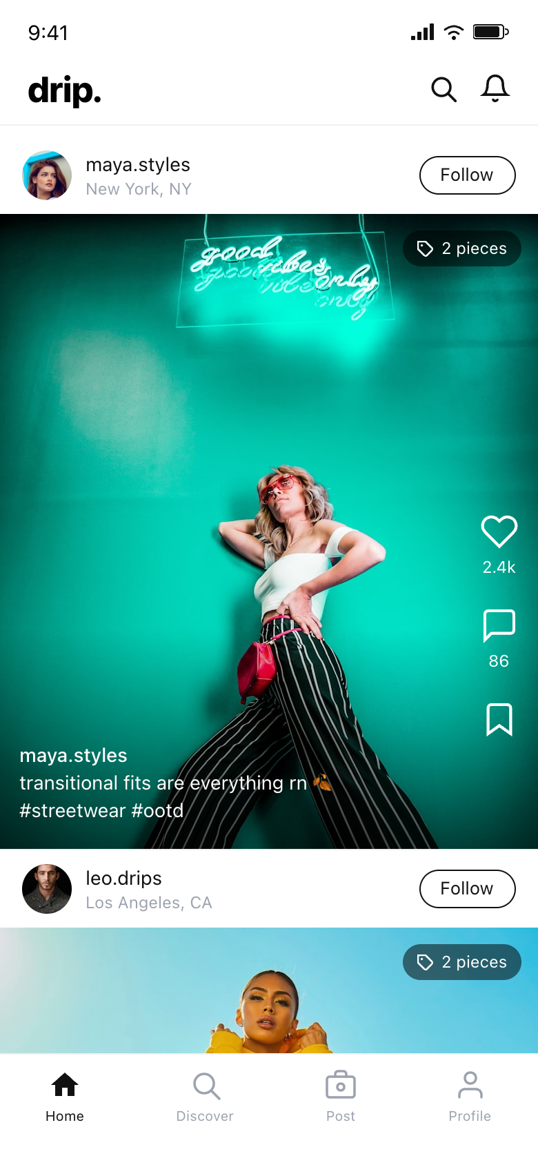
Outfit sharing is scattered across platforms not designed for it. Attribution breaks, source information gets buried, and discovery is nearly impossible unless you already know what you're looking for. The behavior exists — the infrastructure built for it doesn't.
Before any design work began, I mapped the competitive gap across Instagram Shopping, Pinterest, and TikTok with Claude. The gap wasn't feature coverage — none of them treat the outfit as the native content unit. Everything is formatted onto platforms built for something else.
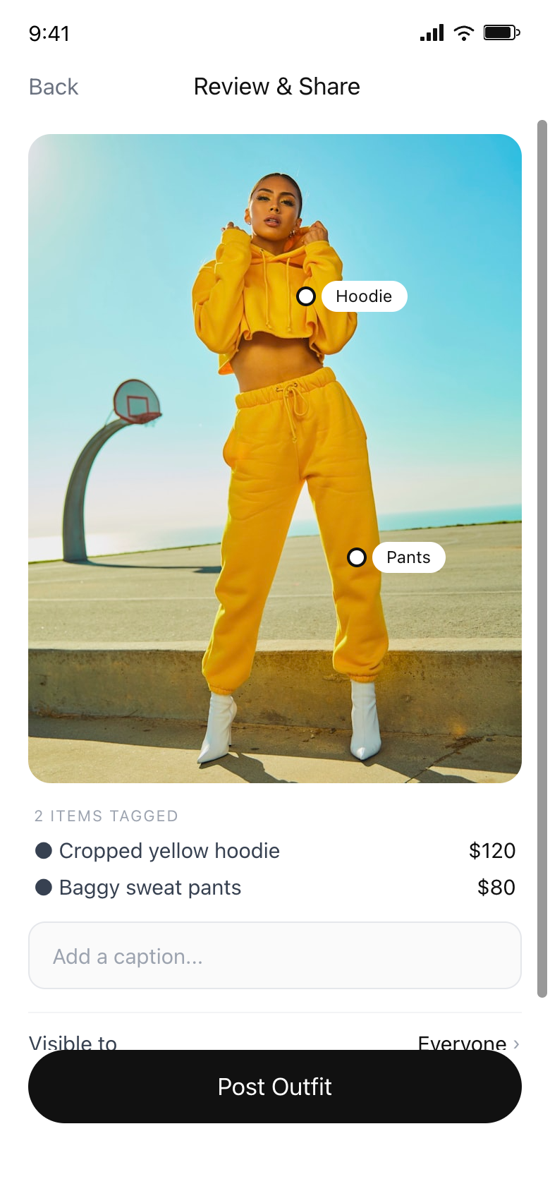
The tagging interface is the core differentiator. Too much friction kills content creation entirely — so I prototyped the tap-to-tag interaction in Paper immediately after the interaction decision was made, before committing to a higher-fidelity tool.
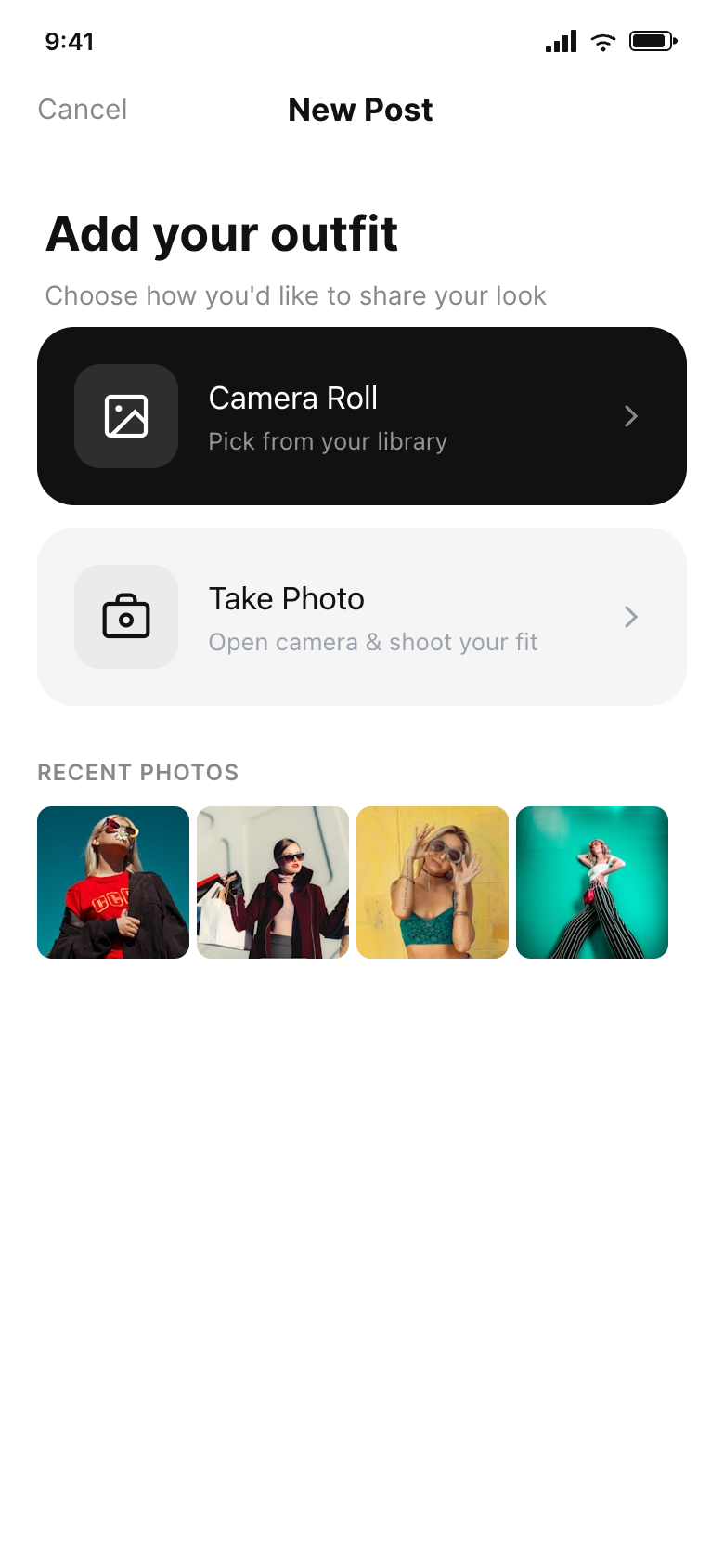
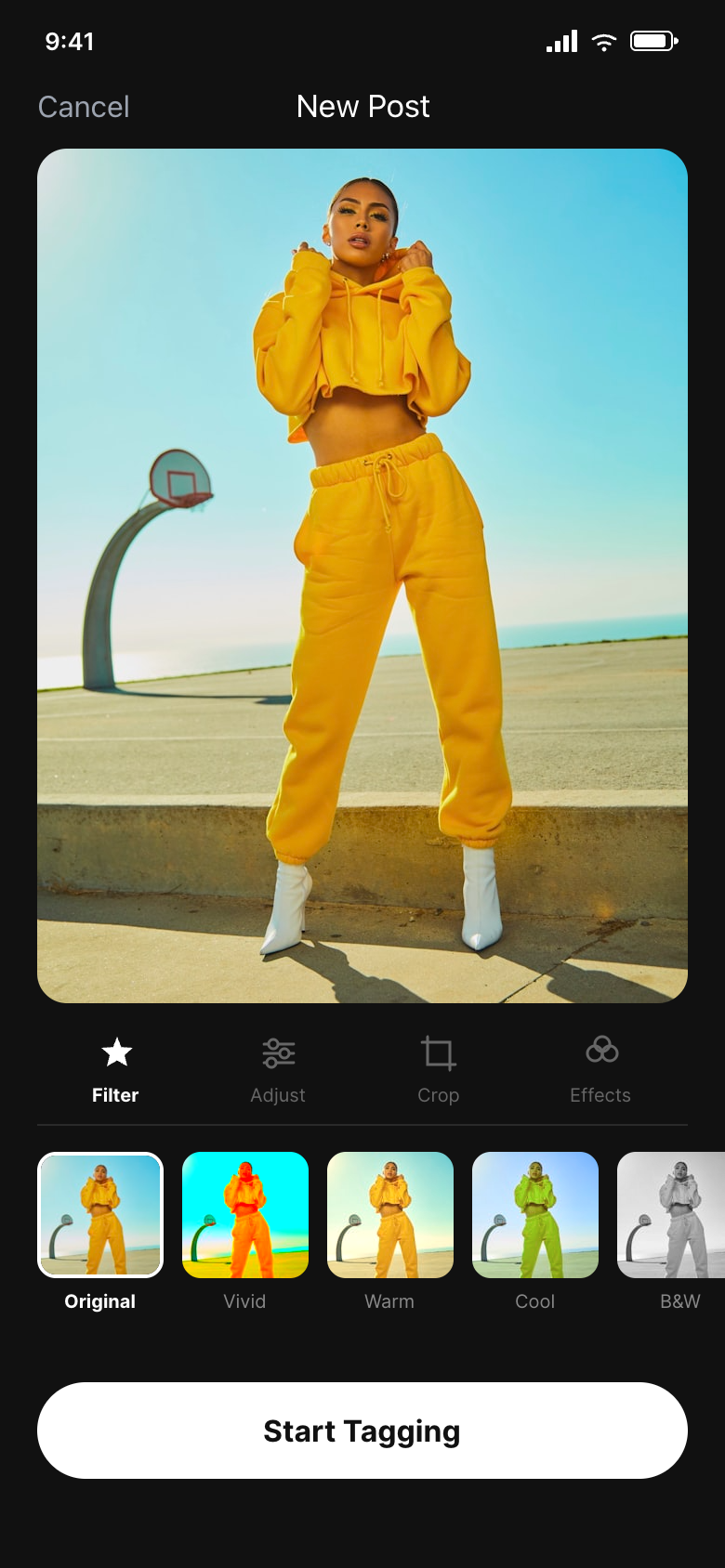
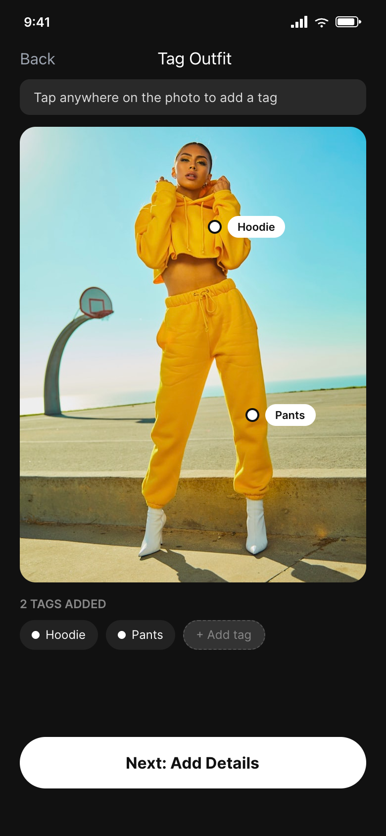
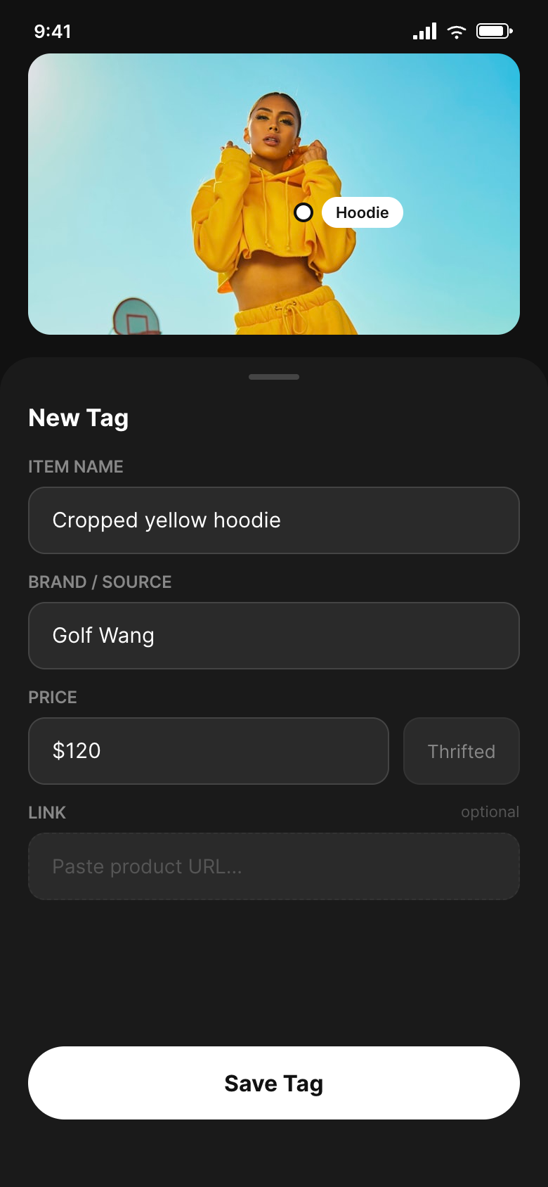
The upload flow splits light and dark deliberately. Browsing and social screens stay white; camera and editing context flips to dark. The dark environment signals focus and reduces visual noise while working on a photo — a pattern worked through with Claude by studying mental mode shifts in creative apps, then validated immediately in Paper across all six frames.
ML tagging was the obvious technical direction and the wrong product decision. Manual tagging means the data is always right, captures indie brands no model would recognize, and sidesteps the cold-start problem entirely. ML can layer in as a suggestion mechanism once the tagging behavior is established — it can't anchor the experience from day one.
drip. is ongoing. The upload and tagging workflow is fully mapped across six Paper frames, but the Discover tab, Profile screen, and social graph mechanics remain to be designed. The next challenge is the cold-start discovery problem — how to surface content to users who aren't yet following anyone. More broadly: this project confirmed that Claude and Paper together function as a genuine rapid-concept workflow. Claude for thinking, Paper for building, the two moving fast enough to keep up with the ideas.